
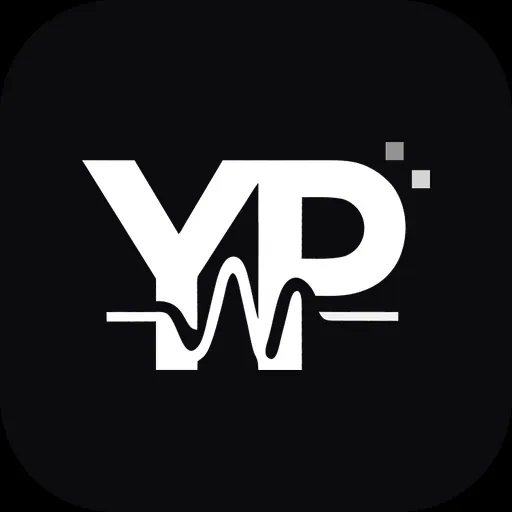
YP Soundwave — the current logo
My current logo is built, like the first one, from my initials — Y and P. This time the letters are stitched together by a sound wave: a single line runs through both of them, rises and falls like a waveform, and joins the two letters into one sign.
It is the simplest way I know to say what this site is about: a name and a sound, written in the same stroke.
YP Monogram — the colour logo
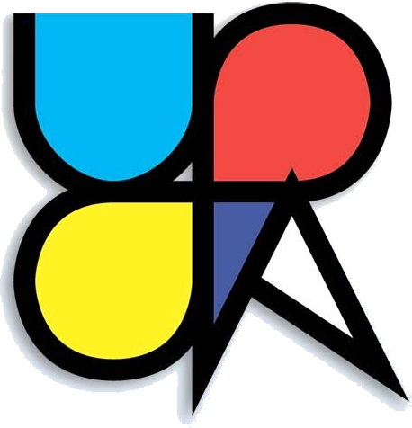
My earlier logo has a story of its own. It is formed by the Latin letters Y and P, written as one symmetrical cursive stroke: the right half of the first letter is at the same time the left half of the second.
Written this way, the two letters form an hourglass — a symbol of eternity.
The colours of its segments stand for the different elements, and the small white triangle that appears between the strokes stands for the mountains — the earth as an element of its own.
Authorship
Both logos are original works by Yauhen Panimatchanka. They are the symbols of my music and of the projects released under the YAUHEN.ORG label — on covers, in videos and on this website.
Please do not copy, modify or use them without my written permission. For press, collaborations or licensing, write to info@yauhen.org.
© Yauhen Panimatchanka. All rights reserved.